

What is one of the important things in web design that is most likely to be forgotten? The answer is the logo. A logo plays an important role in presenting your brand or business. That’s why the design and placement of the logo are very important.
Then, what are the common website logo fails? Most of the failed logos are too small, too big, blurry, or cut off. What is another logo fails that you might experience? Let’s find out.
WHERE TO PLACE YOUR LOGO?
Logo design is not the only thing that matters, but the logo placement is also important as well. The NN Group conducted research about the placement of a logo. The result turns out that the top-left corner of a website is definitely the best position to place your logo.
Why? The result shows the basic human behavior that automatically looks to the top left when searching for the homepage button. People normally do not look at the right-hand corner of a website for a logo. Want to know more about logo placement? Ask a professional web design company for more advice!

Following from above, the research also found out that 89% of users are more likely to remember the brand if the logo is placed on the top-left side. No explanation needed! Left-aligned logos definitely lead to better brand recognition and better performance in terms of navigation.
What about a centered logo? The difference between left or centered logos does not affect brand recognition. But placing a logo and/or navigation in the center can cause confusion of website users. A trick for this problem is to pair a logo with a simple navigation bar that highlights the logo design. Ollie Quinn is an example of a centered logo website.

WHAT ARE COMMON WEBSITE LOGO FAILS? HOW TO AVOID THEM?
1. TOO SMALL
By using a small logo on your website, users may not be able to easily see the logo in just a glance. Perhaps they could not even read your company name which is a total failure.
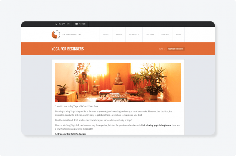
As you can see from the above image from a yoga studio website, it can be obviously seen the misuse of the design and size of the logo. It shows the fact that the text within a logo almost vanishes when the design is scaled down. The solution to this #1 logo failure is to use a symbol-only version of the logo in any places that offer smaller capacity.
Standard logo placement rules require a notable and eye-catching logo which has a bigger size to attract the attention from the navigation menu. That’s the way to make your logo stand out and users can recognize your brand better.
2. TOO BIG
A large logo can distract the users’ attention to what they should not focus on. A bigger logo will have more possibilities to disguise other important elements and navigation items.
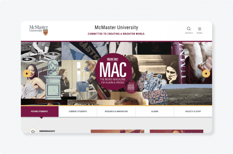
Also, there is a chance to repeat the logo or company name in the area above the fold. See the example from McMaster University’s website down below.
A sticky website header is an option to fix this problem. The sticky effect is when the logo shows in one size in the first screenful and then shrinks as you go down along the site. But it is visible at the top of the page despite the shrinkage.
3. DOES NOT STAND OUT
The worst-case for logo failure is when your logo and website theme has a similar color or color scheme. This is when your logo will get lost in the background.
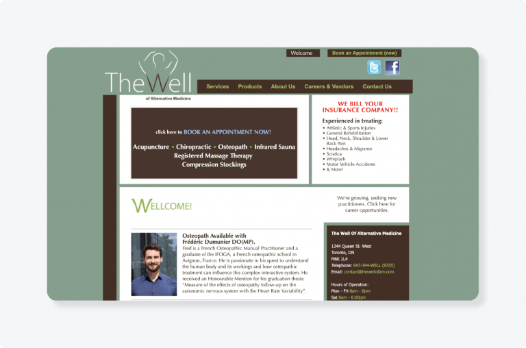
According to the image above, the company is logo is too big and it blends with the background color. Similar to the slogan, misuse of color and placement distract the attention from itself. That’s why the company’s logo and slogan do not stand out at all on this website.
Keep this in mind! The logo is the main superstar of the page. Therefore, it needs to be put anywhere that is easily visible. Be careful with the background color of the placement as well. Using different colors to create a contrast with the theme is also a great idea. No idea about the color of your logo? Hire a web and graphic designer to do it for you.
4. BLURRY
The quality does matter! Do not ignore simple stuff like the quality of the logo’s image file. A blurry logo can create a negative effect more than you think. The most common logo failure is about size. If the size of a logo is wrong, then it may become pixelated and illegible.
A famous solution for this problem is to use a PNG file type instead of a JPEG. A JPEG file ruins all of the image information when the size is reduced or enlarged. Contrasting to a PNG file, you can both increase and decrease the size of a logo without damaging the image.
5. INCONSISTENCY
Consistency in design is the main concern in web design. Nowadays, websites need to be responsive to both laptops and smartphones. When the website is pulled up from different sources, the responsive design of the website should maintain the appearance of the logo across all devices. This problem becomes an easy work as WordPress and Squarespace have a feature to preview how the website on mobile, tablet, and desktop screens.

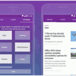
As can be seen from MaRS, the design maintains its good quality and feature on desktop and mobile.
6. CUT OFF
Of course! Considering the placement and colors of your logo is an important job. But please remember, the logo is created to serve as a representation of the brand on a website which also helps navigate users to the homepage.
Please ensure that the logo design is not cut off in a header. The logo failure often comes from a bad placement of the logo which is too close to the margins. That’s why the logo is cut off after the publishing.
The logo is a very essential element for every website. It represents the brand and the website at the same time. To improve your website performance and navigation, it is a must to avoid any failures.
Finding the right design, color and shape for your logo take a lot of time. But do you want to know the trick that can speed up this process? Hiring a professional website design company to get it done for you.